Visualizing Geospatial Data Combining diagrams with geographical data to create unique interactive maps
Geospatial data (often called Geo Data or Geo-Information) is data that has an implicit or explicit association with a location on a map. Examples are the addresses of a group of persons, the sighting locations of animals of endangered species, or a set of airports connected by flight connections.
When visualizing Geo Data, it is intuitive to place the data visualization on top of a map using their associated location to place the data correctly. The link between the data and their geo locations becomes evident at a glance. Furthermore, data with similar sites are placed close to each other.

Interactive maps: Shortest path demo
Therefore the requirements for visualizing Geo Data include visualizing the map and adding the additional data.
Better than just providing a static map with icons is to provide an interactive application where the map control can be navigated. The user can interact with Geo Data to get more information out of it.
Visualizing the map
For visualizing the map part of the diagram, there are many interactive map controls for your preferred platform, e.g.:
- JavaScript: GMaps, D3js, Stately, OpenLayers, Leaflet
- WPF: Bing Maps WPF Control SDK , Syncfusion, XAML.MapControl
- Java: OpenMap, ArcGis, NASA WorldWind
Adding geospatial data onto the map
Most map controls provide means to at least add some marker at geolocations but are quite limited when it comes to more sophisticated visualizations containing individual information and to react on user interaction.
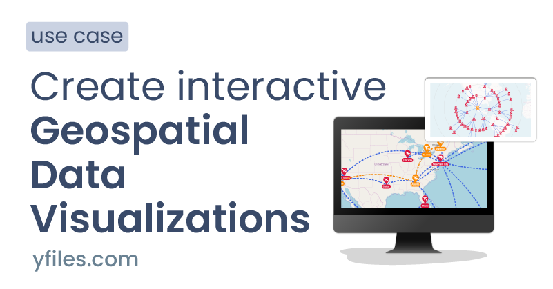
In these cases, a flexible UI component should be used together with the map control to add visualization and interaction for the GeoData. The following example adds airports and flight connections to a map:

Interacting with geospatial data
Usually, the map control has integrated support to pan and zoom the map. It is up to the UI component to keep the user data visualization at their geo coordinates.
The size of Geo Data visualization usually isn't scaled with the zoom level (or at least not in a linear way), so on a higher zoom level, the less exciting data should be filtered out to improve the readability of the diagram.
With the help of a UI component, a Geo Data application can also react to more complex interactions. The following example highlights the shortest flight path between two selected airports (LA and Montreal):
Alternative visualizations of geospatial data
Although mapping Geo Data to Map locations is the most natural way for visualization, alternative views can help to focus on different aspects of the data.
When looking at the example of airports and flight connections, it could be interesting to see how many connecting flights are necessary to get from one airport to another. This could be visualized in a radial fashion placing the start airport in the center and airports reachable with one, two or more flights on corresponding circles around it:

About yFiles: The graph visualization SDK

yFiles is your go-to SDK for crafting advanced graph visualizations, whether you're working with Web, Java, or .NET technologies. Its unmatched flexibility and scalability enable you to convert complex data into clear, actionable visuals, fitting for both enterprise and startup needs.
With yFiles, you're equipped for the future—supporting any data source while maintaining strong data security. Getting started is seamless, thanks to over 300 source-code demos, thorough documentation, and direct access to core developer support. These resources are available even during your free trial.
Backed by 25 years of graph drawing expertise, yFiles is trusted by top companies worldwide for their most critical visualization tasks.
11 reasons why developers choose yFiles, the superior diagramming SDK


Thank you!
Your message has been sent.
We'll get back to you as soon as possible.
Example and source code
With the yFiles libraries, map integration can be realized on all supported platforms. It provides natural means to add custom visualizations for all kinds of data that can adapt to user interaction, and it offers a wide range of built-in user interactions that are fully customizable as well.
yFiles for HTML comes with a Map Integration Sample Application that showcases this flexibility. This example uses Leaflet as map control and yFiles for HTML as the UI component that integrates the airports and flight connections.
The powerful layout algorithms of yFiles can be used to enhance the data on the map e.g., to place labels in free spaces or to provide alternative visualizations like a radial view showing the hops between airports.
The source code of the Map Integration Sample Application is available on the yWorks GitHub repository and part of the yFiles for HTML package.
Visualize geospatial data in your application
Test the yFiles for HTML diagramming library with a fully-functional trial package . To display geospatial data in your application, start with the Map Integration Sample Application that is part of the yFiles package. It's not only a showcase application but also provides best-practice source code that you can re-use in your project. yFiles makes it easy to customize all aspects of this application, for example, include your custom styling, change the user interaction, or load the data from your data source.
1. Download yFiles
2. Navigate to the sample application
3. Explore the features
- adjust its source code to match your requirements or
- copy the source code of the features you like to your projects.
Recap
Visualizing geospatial data
Geospatial data visualization is the practice of placing data objects and relationships in the context of their physical locations, unlocking insights into patterns, flows, and relationships across space. From mapping addresses, tracking animal sightings, or visualizing global transportation networks, geo-enabled diagrams enrich data exploration by making spatial patterns immediately visible and tangible.
The yFiles SDK excels at combining interactive graph diagrams with geographical maps, supporting integration with platforms like Leaflet or OpenLayers for interactive map visualization. yFiles makes it easy to overlay complex data—such as airports and flights—over maps, with advanced features for data binding, visual styling, and dynamic updates described in adding geospatial data. Its rich set of user-interaction options enables users to explore and filter geo-data or analyze network structures in alternative arrangements, like shortest-path or radial views (alternative visualizations), supporting both spatial and relational exploration.
For practical application, developers can use the Map Integration Sample Application and reference the source code for building highly customizable, data-driven geo-visualizations with yFiles.
Related content
Choose your next steps
Get connected
Connect with our Customer Success Team regarding your ideas or projects.

Download yFiles
Try yFiles free of charge.
