Interactive Supply Chain Visualization in JavaScript A step-by-step developer tutorial with live code examples
Learn how to build professional, interactive supply chain visualizations using yFiles for JavaScript. This hands-on developer tutorial demonstrates how to transform complex supply chain data into dynamic, editable diagrams that reveal material flow, processing dependencies, and inventory status.
With live, editable code playgrounds, you'll see how yFiles' hierarchical layout algorithm intelligently arranges supply chain elements for optimal insight.
You'll learn how to visualize and analyze:
- Material quantities and real-time availability
- Production dependencies and processing relationships
- Resource allocation and consumption across processes
- Flow constraints and bottlenecks, identified programmatically

Interactive supply chain diagrams — fast, clear insights
yFiles enables high-performance, interactive supply chain visualizations with automatic layouts, flexible styling, and live data binding.
Reveal flows, inventory levels, and bottlenecks quickly — integrates with Java, .NET, and web applications.


Thank you!
Your message has been sent.
We'll get back to you as soon as possible.
Practical coding implementation guide
Build your own interactive supply chain visualization step by step. Expand each section below to dive into implementation details, hands-on code, and live playgrounds for every development phase.
1. Prepare and import your supply chain data
Begin by structuring your supply chain data in JSON format. Define nodes for materials and products, and edges for their relationships. Initialize the GraphComponent and create the basic network structure using GraphBuilder. Apply the hierarchical layout algorithm for an initial arrangement.
- Parse supplier, warehouse, and shipment data into graph nodes using yFiles' data binding APIs.
- Import data from JSON, REST API, or directly from business systems.
2. Enhance visual information
Make your visualization meaningful and readable:
- Style nodes based on material types and categories
- Adjust node sizes for inventory levels
- Add descriptive labels for materials and quantities
- Style edges for different flows
- Implement dynamic color coding for product categories
- Place important metrics as node/edge labels
3. Optimize the layout arrangement
Tune the graph layout for clarity and insight:
- Use hierarchical layout to organize supply chain layers
- Position raw materials at the diagram's start
- Align processing steps logically
- Optimize edge routing/minimize crossings
- Place quantity labels for best readability
- Group related materials and processes
4. Implement interactive features
Add advanced user interaction:
- Enable zooming and panning
- Implement node selection and highlighting
- Add tooltips with detailed info
- Create context menus for context-specific actions
- Enable drag and drop for process refinement
- Add dynamic filtering and exploration tools
What each phase includes
- Complete, ready-to-use code samples
- Interactive online playgrounds for every step
- Developer commentary and troubleshooting tips
- Best practices and performance guidance
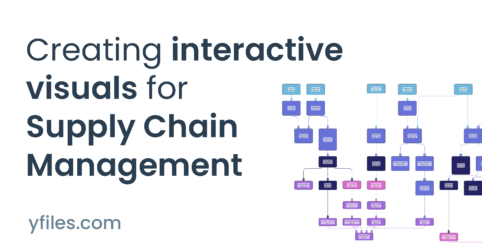
Example: Interactive supply chain diagram
See how a basic material network evolves into a production-ready supply chain visualization:
- Flexible layouts (top-to-bottom, left-to-right)
- Node sizes reflect current inventory
- Colors show material categories
- Edges and labels display material flow and quantities
- Interactive features enhance exploration and clarity

Typical supply chain model
- Materials: Categorized building blocks for products
- Quantities: Model stock, flow rates, and units processed
- Combinations: Combine materials into products or new units
Network structure
- Nodes: Represent materials or products
- Edges: Show transformation or flow between them
- Automatic layouts and visual cues simplify complex processes into clear, actionable diagrams
Data import
Load the node and edge data
The easiest way to work with supply chain data is to provide it as structured objects. A simple JSON file or JavaScript object is usually a great starting point. Of course, you could also load the data dynamically from a database or fetch it via a REST API. In this example, we use a JSON file with nodes and connections:
  {
  "items": [
    { name: "Iron-Vein", id: 5, stack_size: 50, category: "Raw Material" },
    { name: "Cobblestone", id: 6, stack_size: 50, category: "Raw Material" },
    ...
  ],
  "connections": [
    { sourceId: 5, targetId: 6, amount: 1, category: "Raw Material" },
    ...
  ]
}
- Each node has a name, an id, a stack size, and a category.
- Each connection links a source node to a target node using the id.
- Any additional properties you define are also available in the graph and can be visualized.
Initialize the GraphComponent
Next, we create the rendering surface for the graph:
  const graphComponent = new GraphComponent('#graphComponent')
const graph = graphComponent.graph
The GraphComponent mounts to any existing DOM element by passing a CSS selector. In this
case, we use the id="graphComponent".
In the yFiles Playground this setup is already done for you. When developing locally, however, this step is required to render the graph.
1. Create the supply chain from business data
Now we can build the graph from the imported data and apply a basic HierarchicalLayout to quickly get an overview of the structure.
  graph.nodeDefaults.size = [70, 70];
  graph.nodeDefaults.style = new ShapeNodeStyle({
    shape: ShapeNodeShape.ELLIPSE,
    cssClass: "node",
  });

  graph.nodeDefaults.labels.style = new LabelStyle({
    shape: LabelShape.PILL,
    backgroundFill: "white",
    backgroundStroke: "1px solid #6A8293",
    font: "15px poppins",
    textFill: "#6A8293",
  });


  graph.edgeDefaults.labels.style = new LabelStyle({
    shape: LabelShape.PILL,
    backgroundFill: "#6A8293",
    backgroundStroke: "1px solid white",
    font: "15px poppins",
    textFill: "white",
  });
  graphComponent.fitGraphBounds()
Even with minimal configuration, yFiles arranges the graph intelligently and produces a useful first visualization. The GraphBuilder makes it easy to load structured data, and later on you can customize both the appearance and the layout in detail.
2. Make information visible
To enrich the visualization, we configure the GraphBuilder to show additional information.
Improve material visualization
  graph.nodeDefaults.size = [70, 70];
  graph.nodeDefaults.style = new ShapeNodeStyle({
    shape: ShapeNodeShape.ELLIPSE,
    cssClass: "node",
  });

  graph.nodeDefaults.labels.style = new LabelStyle({
    shape: LabelShape.PILL,
    backgroundFill: "white",
    backgroundStroke: "1px solid #6A8293",
    font: "15px poppins",
    textFill: "#6A8293",
  });


  graph.edgeDefaults.labels.style = new LabelStyle({
    shape: LabelShape.PILL,
    backgroundFill: "#6A8293",
    backgroundStroke: "1px solid white",
    font: "15px poppins",
    textFill: "white",
  });
  graphComponent.fitGraphBounds()
Node size now reflects the available stock, while the color shows the material category. For example, "Raw Material" units are displayed in light blue.
Improve label visualization
  graph.nodeDefaults.size = [70, 70];
  graph.nodeDefaults.style = new ShapeNodeStyle({
    shape: ShapeNodeShape.ELLIPSE,
    cssClass: "node",
  });

  graph.nodeDefaults.labels.style = new LabelStyle({
    shape: LabelShape.PILL,
    backgroundFill: "white",
    backgroundStroke: "1px solid #6A8293",
    font: "15px poppins",
    textFill: "#6A8293",
  });


  graph.edgeDefaults.labels.style = new LabelStyle({
    shape: LabelShape.PILL,
    backgroundFill: "#6A8293",
    backgroundStroke: "1px solid white",
    font: "15px poppins",
    textFill: "white",
  });
  graphComponent.fitGraphBounds()
Labels can be styled in the same way as nodes and edges, making the network easier to read at a glance.
3. Improve arrangement
The default HierarchicalLayout already creates a clean visualization, but we can adapt it to better match our supply chain use case.
For example, raw materials can be aligned at the start of the diagram to emphasize the flow of production.
  graph.nodeDefaults.size = [70, 70];
  graph.nodeDefaults.style = new ShapeNodeStyle({
    shape: ShapeNodeShape.ELLIPSE,
    cssClass: "node",
  });

  graph.nodeDefaults.labels.style = new LabelStyle({
    shape: LabelShape.PILL,
    backgroundFill: "white",
    backgroundStroke: "1px solid #6A8293",
    font: "15px poppins",
    textFill: "#6A8293",
  });


  graph.edgeDefaults.labels.style = new LabelStyle({
    shape: LabelShape.PILL,
    backgroundFill: "#6A8293",
    backgroundStroke: "1px solid white",
    font: "15px poppins",
    textFill: "white",
  });
  graphComponent.fitGraphBounds()
Improve edge label placement
To make the diagram even clearer, we can position edge labels at the incoming side of a material node, so the required amounts are visible exactly where they are used.
  graph.nodeDefaults.size = [70, 70];
  graph.nodeDefaults.style = new ShapeNodeStyle({
    shape: ShapeNodeShape.ELLIPSE,
    cssClass: "node",
  });

  graph.nodeDefaults.labels.style = new LabelStyle({
    shape: LabelShape.PILL,
    backgroundFill: "white",
    backgroundStroke: "1px solid #6A8293",
    font: "15px poppins",
    textFill: "#6A8293",
  });


  graph.edgeDefaults.labels.style = new LabelStyle({
    shape: LabelShape.PILL,
    backgroundFill: "#6A8293",
    backgroundStroke: "1px solid white",
    font: "15px poppins",
    textFill: "white",
  });
  graphComponent.fitGraphBounds()
4. Apply different layout options
yFiles provides a variety of automatic layout algorithms and options to further refine the result. You can, for example, switch the layout orientation from top-to-bottom to left-to-right, or enable automatic edge grouping.
In the Playground example, both options can be toggled directly in the tooltip.
  graph.nodeDefaults.size = [70, 70];
  graph.nodeDefaults.style = new ShapeNodeStyle({
    shape: ShapeNodeShape.ELLIPSE,
    cssClass: "node",
  });

  graph.nodeDefaults.labels.style = new LabelStyle({
    shape: LabelShape.PILL,
    backgroundFill: "white",
    backgroundStroke: "1px solid #6A8293",
    font: "15px poppins",
    textFill: "#6A8293",
  });


  graph.edgeDefaults.labels.style = new LabelStyle({
    shape: LabelShape.PILL,
    backgroundFill: "#6A8293",
    backgroundStroke: "1px solid white",
    font: "15px poppins",
    textFill: "white",
  });
  graphComponent.fitGraphBounds()
Summary
How to create an interactive supply chain visualization with yFiles
1. Prepare and Import Your Supply Chain Data
2. Enhance Visual Information
- Style nodes based on material types and categories
- Adjust node sizes to reflect inventory levels
- Add descriptive labels for materials and quantities
- Style edges to represent material flow
- Implement dynamic color coding for different product categories
3. Optimize the Layout Arrangement
- Position raw materials at the diagram's start
- Align processing steps in logical layers
- Optimize edge routing to minimize crossings
- Place quantity labels at strategic positions
- Group related materials and processes
4. Implement Interactive Features
- Enable zooming and panning
- Implement node selection and highlighting
- Add tooltips with detailed information
- Create context menus for additional actions
- Enable drag and drop functionality
5. Customize Layout Options
- Switch between vertical and horizontal orientations
- Enable automatic edge bundling
- Adjust spacing and alignment parameters
- Configure layer constraints
- Fine-tune edge label placements

Recap
Interactive supply chain visualization in JavaScript
Interactive supply chain visualization is an advanced approach for mapping, analyzing, and optimizing supply network data through dynamic, editable diagrams. Visualizing supply chains allows organizations to uncover material flows, production dependencies, inventory levels, and process bottlenecks with greater clarity than traditional spreadsheets or static charts.
The yFiles SDK is especially well-suited for this purpose, empowering developers to build custom supply chain visualizations in JavaScript that feature automatic layouts, real-time data binding, and extensive customization. The interactive coding guide in the practical coding implementation demonstrates how to load supply chain data, style elements, optimize layouts, and implement advanced features like zooming, tooltips, and filtering. These tools make it possible to model dependencies, track material quantities, and immediately visualize the effects of changes, delivering actionable insight for decision-makers.
Developers can import data from JSON, APIs, or business systems (Data Import), use hierarchical layout algorithms to clarify process flows, and apply live style adjustments or interactions. The summary consolidates the key phases and features for building scalable, interactive supply chain visualizations with yFiles.
Related content
Got questions about
interactive supply chain visualizations?
Email: hello@yworks.com
Phone: +49 7071 9709050
Choose your next steps
Get connected
Connect with our Customer Success Team regarding your ideas or projects.

Download yFiles
Try yFiles free of charge.
